
モバイル向け「通知」アクションテンプレートの詳細と使い方の説明です。
本ページの内容は、以下「対象のアクションテンプレート」に記載のテンプレートに対応しています。
概要
モバイル向け「通知」アクションテンプレートは、「すべてのメニュー > Action > 接客テンプレート > ユーザーに「見せる」> 通知」から選択できます。
テンプレート検索窓より、「モバイル」というキーワードでの検索も可能です。
対象のアクションテンプレート
こちらのテンプレートはモバイル向け(PCブラウザ非対応)です。
- 【モバイル向け】通知01
- 【モバイル向け】通知02
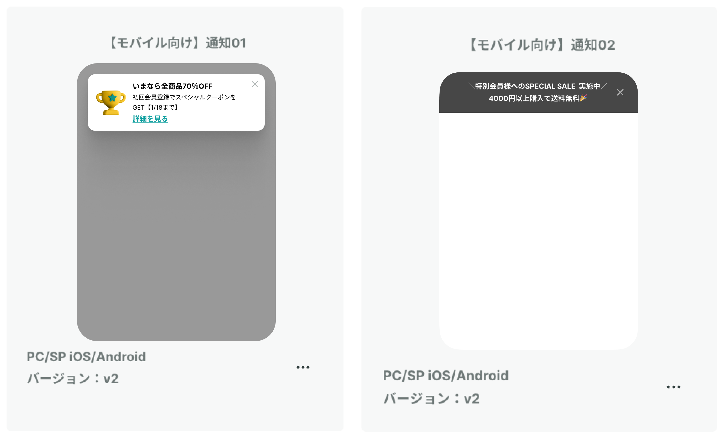

各テンプレートの3点リーダーより、接客サービスを作成できます(参考)。
アクション設定(ベーシック)
編集画面「ベーシック」タブから設定可能な項目は、以下です。
2-1. 見出し・詳細テキスト
通知の見出し・詳細テキストを入力します。
空白の場合は、エリアごと非表示にできます。

【テキストを左寄せにする】オプションで、テキストの表示位置を切り替えられます。
- チェックあり:テキストを左寄せで表示
- チェックなし:テキストを中央寄せで表示

2-2. テキストリンク(テキスト・リンク先)
【テキストリンクを表示する】オプションで、テキストリンクの表示を切り替えられます。
- チェックあり:テキストリンクを表示する(通知タップ時の遷移あり)
- チェックなし:テキストリンクを表示しない(通知タップ時の遷移なし)
通知をタップした時に特定のページに遷移させたい場合は、テキストリンクを利用してください。
テキストリンクのテキストと、リンク先を指定できます。
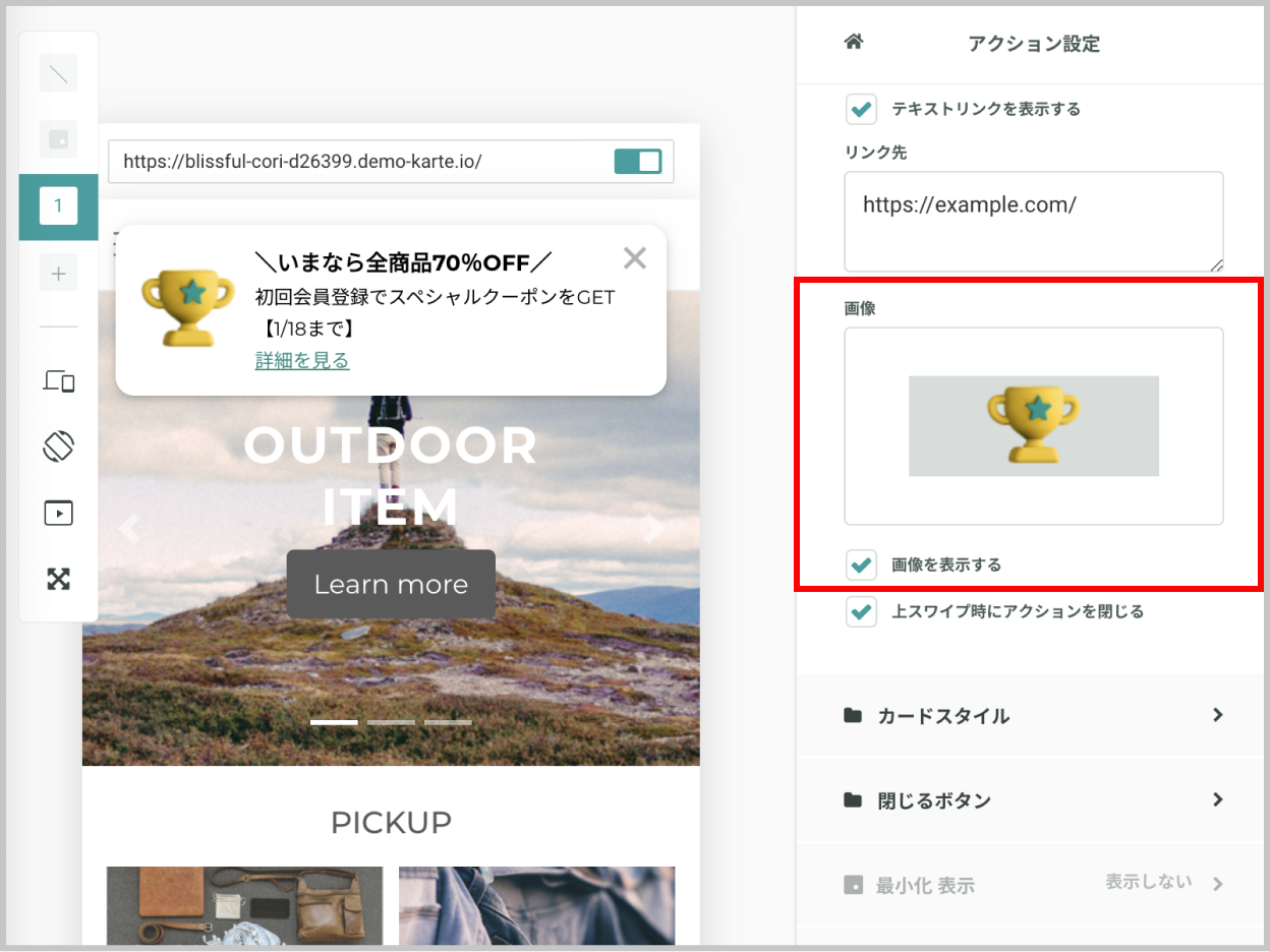
2-3. 画像
【画像を表示する】オプションで、画像の表示を切り替えられます。
- チェックあり:画像を表示する
- チェックなし:画像を表示しない
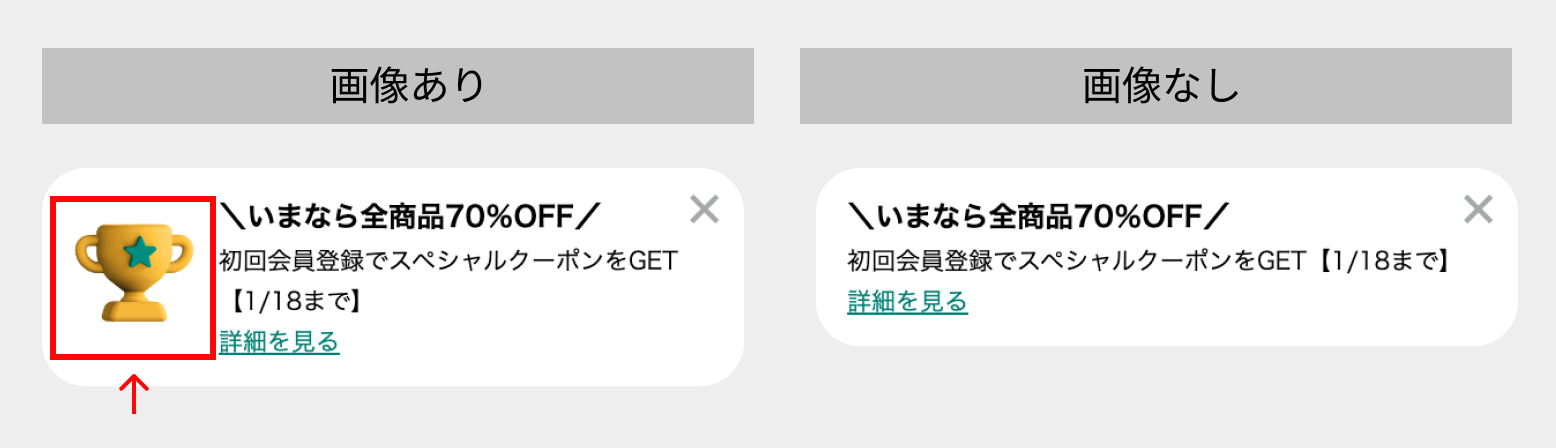

通知内の画像を設定できます。
参考:「画像 / アイコン」変更方法
- 推奨画像サイズは、最大
縦:180px、横:180pxです。 - 画像の表示サイズは「カードスタイル>画像幅(px)」より指定できます

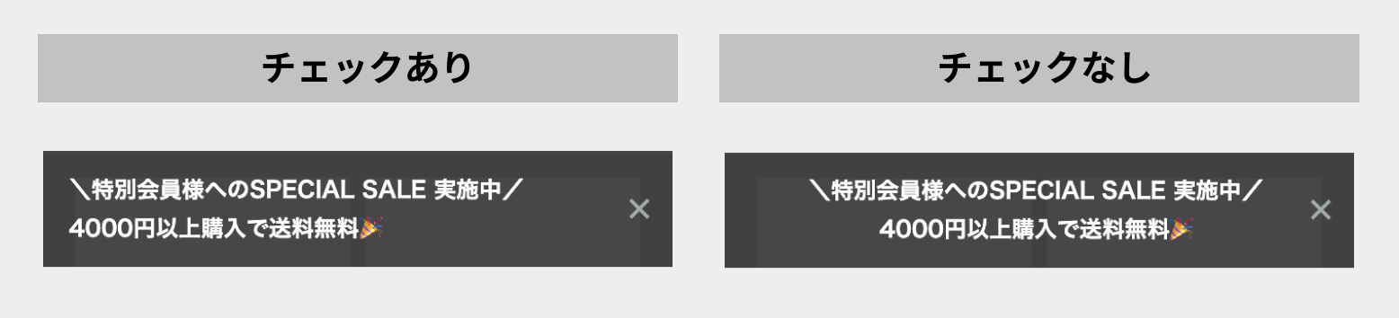
2-4.上スワイプ時にアクションを閉じるオプション
ポップアップをスワイプ操作した時の、挙動を切り替えられます。
- チェックあり:スワイプ操作をした時に、通知を「閉じる」
message_closeイベントが自動で発生します
- チェックなし:スワイプ操作をした時に、通知を「閉じない」
通知の表示設定で「下にスライド」アニメーションをつける場合は、チェックありを推奨です。

2-5. カードスタイル
通知カードのスタイル設定ができます。
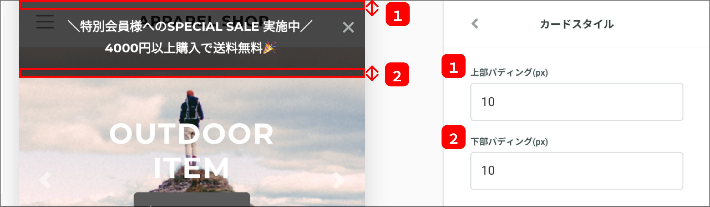
【通知02テンプレートのみ】
- ① 上部パディング(px):カード上部のパディングを指定できます
- ② 下部パディング(px):カード下部のパディングを指定できます

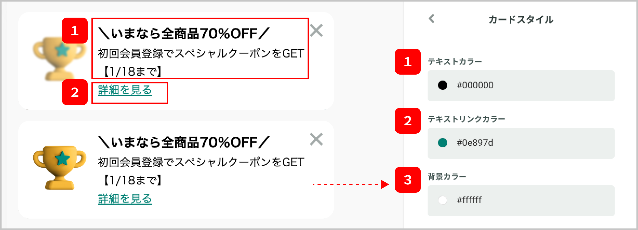
【共通】
- ① テキストカラー:見出し・詳細テキストのカラーを指定できます
- ② テキストリンクカラー:テキストリンクのカラーを指定できます
- ③ 背景カラー:カードの背景カラーを指定できます
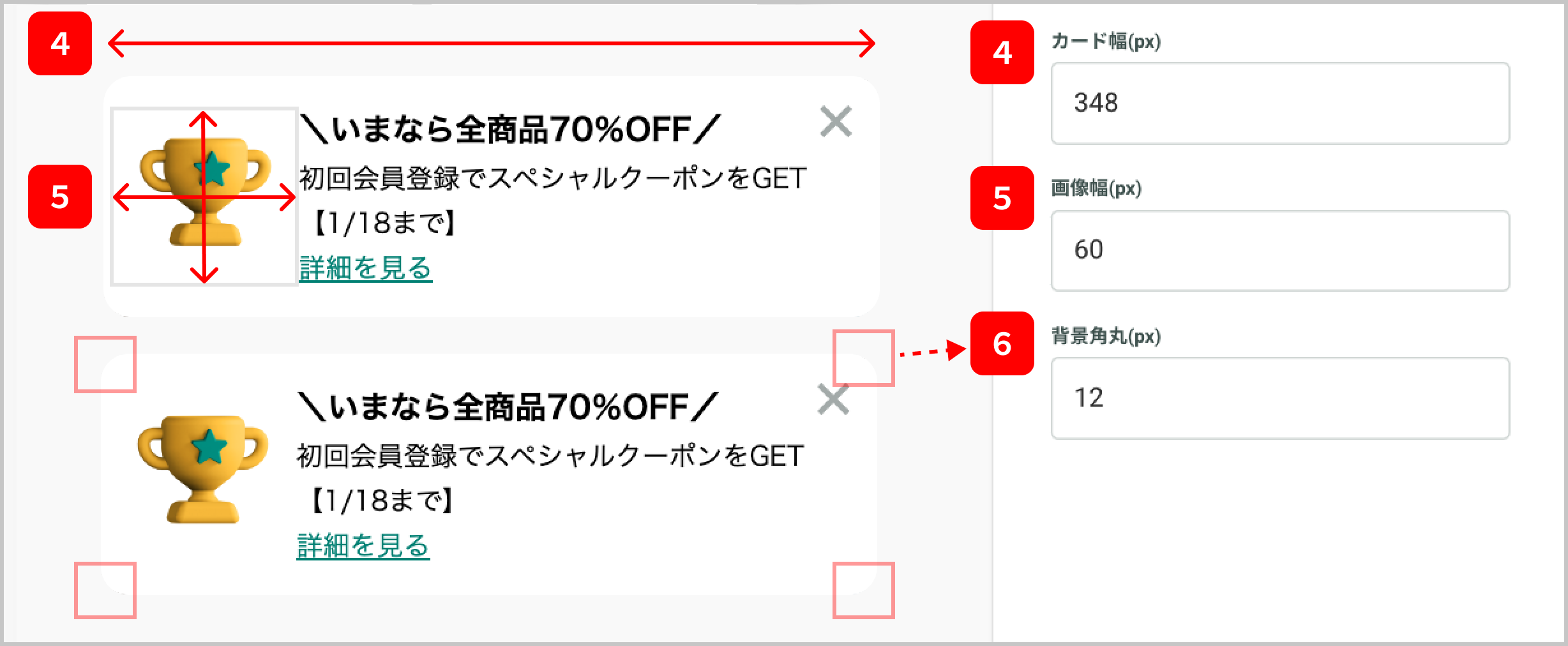
- ④ カード幅(px):カードの横幅を指定できます
- ※縦幅は、カード内の要素に応じて自動で調整されます
- ⑤ 画像幅(px):カード内画像の表示サイズ(幅)を指定できます
- ※正方形で表示されるため、縦幅と横幅は一律になります
- ⑥ 背景角丸(px):カードの四隅に丸みを持たせることができます
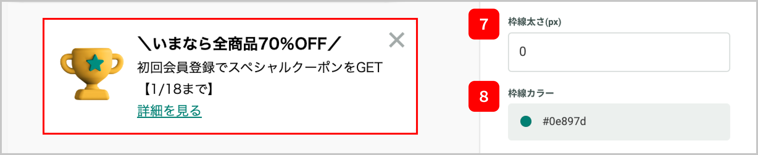
- ⑦ 枠線太さ(px):カードに枠線をつけ、太さを指定できます
- ※枠線をつける場合は、1以上を指定してください
- ⑧ 枠線カラー:カードの枠線カラーを指定できます


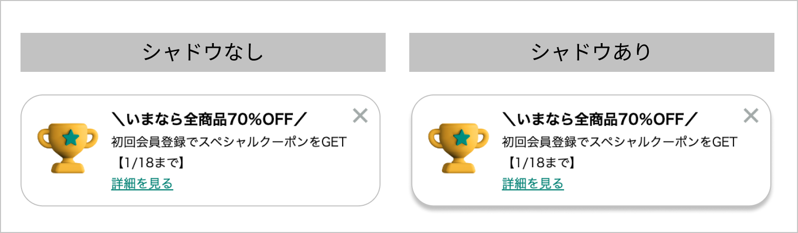
【シャドウをつける】オプションで、シャドウの表示を切り替えられます。
- チェックあり:カードにシャドウをつける
- チェックなし:カードにシャドウをつけない

2-6. 閉じるボタン
閉じるボタンの表示位置・デザインを指定できます。
- 閉じるアイコン:閉じるボタンのアイコンを指定できます
- アイコンカラー:アイコンのカラーを指定できます
- 背景カラー:背景のカラーを指定できます
- アイコン幅(px):アイコンを表示する幅を指定できます
- ボタン上位置(px)、ボタン右位置(px):アイコンの表示位置を指定できます
2-7. 表示設定
アクションの表示位置・アニメーションを指定できます。
「表示位置・表示タイミング」変更方法
2-8.データ管理
ユーザー情報変数を指定することで、ユーザーごとに紐づく値を動的に出しわけができます。
「静的変数・ユーザー情報変数」利用方法・仕様
アクション設定(カスタマイズ)
編集画面「カスタマイズ」タブから、HTML/CSS/JavaScriptを変更し、より高度なカスタマイズが可能です。
アクションの具体的なカスタマイズ方法関しては、チャットでのお問い合わせも含め、サポート対象外となりますので、ご了承ください。
その他
4-1.リンク先の指定について
アプリ内の特定画面に遷移させたい場合は、ディープリンクを指定します。
※Android/iOSでディープリンクが異なる場合は、それぞれ接客の作成が必要です。
参考:KARTE for Appで配信される接客のリンク制御
一つのテンプレート上で、WEB/iOS/Androidすべての遷移先を指定したい場合は、アクションのカスタマイズが必要です。
アクションの具体的なカスタマイズ方法関しては、チャットでのお問い合わせも含めサポート対象外となります、予めご了承ください。
4-2.カスタムテンプレートを追加する
作成したアクションは、テンプレートとして追加することで、別の接客作成時に参照できます。
詳細は、カスタマイズしたアクションをカスタムテンプレートに追加する方法をご参照ください。